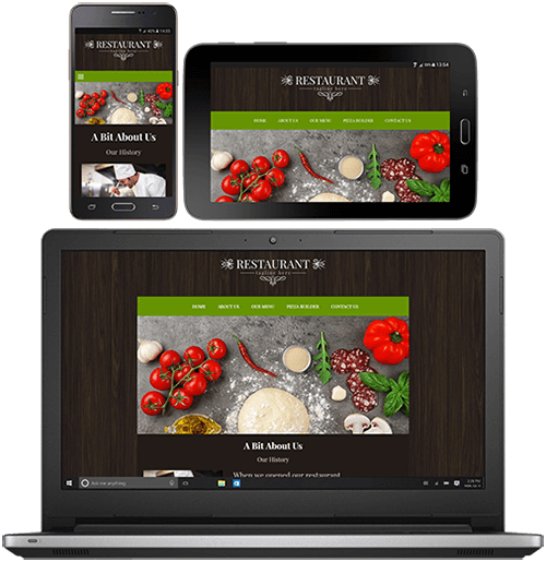
What is responsive design? Responsive design is a design that suits the website visitor on any device, in a world with a fast growing Smartphone and Tablet market more and more people every day are doing all their browsing on these devices.
This means that all the websites they visit, most importantly your website, needs to fit their device without sacrificing the design or cutting out features. Here at Sterling Web Solutions we build your website from the ground up to look absolutely stunning on Desktop Computers or Laptop as well Tablets and Smartphones.
More people today own multiple hand held devices than Computers, and this industry is rapidly growing, to ensure your website appeals to everyone, its important to have a responsive, mobile friendly website to avoid losing out on website traffic. Google also encourages everyone to create a mobile friendly website; these sites are ranked higher on search engines, allowing EVEN MORE traffic to come to your website.
Don’t hesitate to contact us, your website and its traffic are important to your business, and having a high ranked, easy to browse website no matter what device is viewing it can boost your business! Even if you have a separate mobile site already this can be doing harm to your rankings with Google, who penalize duplicated content, this also cuts a device user out of the experience, and no user ever wants to see that they can’t get the full experience across all platforms.
A website can look amazing on large or small screens, and showing your clients that you care by accommodating to their needs in an ever expanding industry shows them that you value them! Our designs are tailored to your tastes and we ensure all designs are friendly on all devices, with this our expert SEO services and guaranteed 99.5% website uptime you will never be disappointed! Contact us today for a quote!